Tupperware
Who: Tupperware, the homeware brand that has come to stand for the category of plastic containers
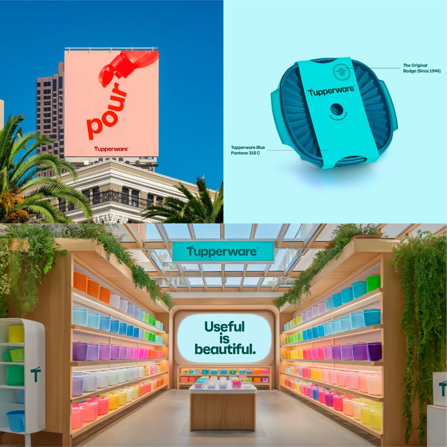
Why: The company is struggling with deep financial problems and is closing facilities and laying off employees. A key aspect of its turnaround strategy is a much wider retail presence, and of course this meant a brand refresh. Remember that traditionally the brand sold only through Direct Sales Agents and “Tupperware parties,” and has been too slow to accept change. It doesn’t help that there are hundreds of cheaper options that look exactly the same as Tupperware products.
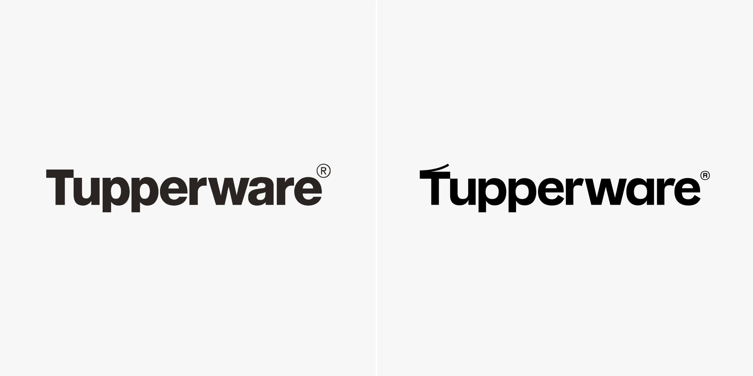
What: The new look was designed by Landor, USA. The ‘T’ in the new logo represents the moment when a lid on a container is pulled back and the new identity has much more colour.