A Seamless Brand Experience For Irasva
Landor & FITCH design a contemporary jewellery brand aimed at modern women
The Client
Renaissance Global designs and manufactures fine jewellery across the world and is the licensee for brands like Hallmark and Enchanted Disney. In 2019, the group launched their first B2C brand of ‘everyday’ jewellery in the Indian market, through a joint venture with Bennett, Coleman and Company Limited.
Me & Mine
Women, says Lulu Raghavan, Managing Director, Landor, Mumbai, tend to have an extremely intimate connection with their jewellery. Building upon this connection, Landor & FITCH proposed the brand positioning of ‘Me and Mine,’ which is founded on the idea of self-love and expression.
In a departure from traditional brands that focus on jewellery being gifted to a woman, Irasva believes that modern, independent women understand the importance of loving and expressing themselves.

The
name Irasva, takes this idea further and is a combination of ‘Ira’ meaning love
and ‘Sva’ meaning the essence of self.
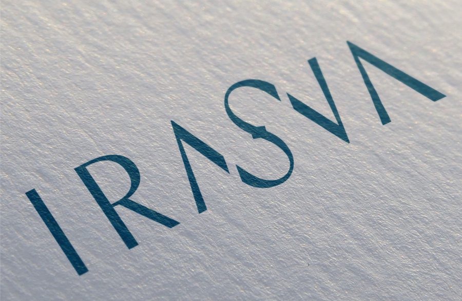
The Brand Identity
Landor & FITCH created a stylised wordmark for Irasva, using contemporary, precise letterforms, with an elegant ligature between ‘A,’ ‘S’ and ‘V’. The ‘S’ takes inspiration from the infinity symbol and is punctuated by a small diamond. The unit with the ligature is pulled out and used as a pattern on applications like wrapping paper.

The colour palette is an unusual one, shunning the traditional, heavy tones of Indian jewellery brands. The pink and blue hues were chosen carefully to break stereotypes and signal the contemporary personality of the brand. This is further reinforced by the photography style, where product images are shot against pastel backgrounds. The brand font is TT Nooks.
The Retail Experience
Landor & FITCH also created a customer-centric, immersive retail experience for Irasva’s flagship store in South Mumbai.

Taking the brand idea of ‘Me and Mine’ forward, the store echoes the desire for individuality and has been designed for self-discovery. The idea was to go beyond just selling, and feature additional reasons to dwell and interact. The Landor & FITCH team says that “From inspiration and exploration, through buying and post-purchase – the cross-channel journey aims to be fluid and break down barriers through the customer experience.” The open design layout and focus on product, helps customers to shop ‘their’ way, as opposed to traditional layouts where sales staff show jewellery piece by piece across the counter.


Would love to see how this works in a small space like a ring. We had the same problem with out brand name which was quite long. Are they using just the I? or the S with the stone?
The colour palette is unusual and fresh and the typography is quite smart – one wouldn’t expect any less from Landor but I wish there were more important brand applications like the box for instance, which a customer would take home and keep the jewellery in.