Bakheda Crafts New Brand Identity for Swedish Paper Brand
The Northstar brand is inspired by its Scandinavian heritage and tells a story of preservation and sustainability �
The Client
KorCo is a Swedish paper company, supplying manufacturers around the world with Scandinavian paper products. In 2019, they launched a new brand of paper cup stock, to supply the world with the highest sustainability standards in the industry.
Introducing Northstar
The project started with a competitive review and market analysis. Based on learnings, Bakheda says they developed a creative brief that combined the story of Scandinavia’s history and untamed wilderness, with the region’s sustainable values and desired future.
The team arrived at the name ‘Northstar’ – a universally recognised symbol of ambition and navigation.
“In Swedish folklore, we tell our children that if you’re ever lost, just follow the Northstar and you’ll find your way home.”
Arvid Lithander, Founder, Bakheda Co.
A Utilitarian, Evocative Design System
The style for the Northstar brand was deliberately simple and functional, to help the brand stand out in a visually saturated market.
The Nord
Every component of the brand identity has a story to tell and encapsulates a slice of Scandinavian heritage. The Northstar symbol is called the ‘Nord’, which is Swedish for ‘North’. While the symbol appears to be a straightforward star shape, it is actually derived from the runic alphabet ‘Ingwaz’ which means ‘life’.

The logotype is crafted from a custom font, which is a modernised adaptation of the old rune script.
The monogram
For cases where the entire logo can not be applied, a monogram has been derived with the ‘n’ from the wordmark and the ‘Nord’ to create a smaller version of the identity.

The colours
The brand colours reflect the colourful Scandinavian seasons and are named after the Norse Gods. Idunn Green – a lush green for spring and summer, Irpa Brown – a vivid brown for fall and Balder White – a crisp white for winter.
The typography
Northstar uses the simple and hard-working Grotesk Sans superfamily – Halyard. While each subfamily is vastly different in appearance, when seen together, they maintain a consistent personality that works well in different sizes.
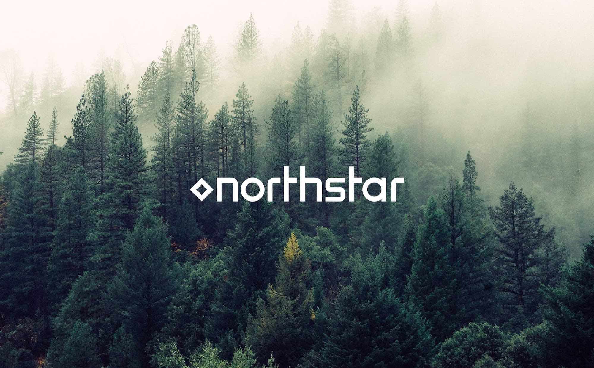
Imagery and patterns
The imagery showcases the beautiful northern woods. Together with the logo and messaging, it ties together the emotional story of preservation and sustainability. The patterns are also derived from natural textures. The Bakheda team says that they took images of tree stumps and traced the forms within to create a series of memorable brand patterns.

Tools for the Team
Detailed guidelines have been created to enable the Northstar team to implement the identity seamlessly. Bakheda says that they were “careful about being grounded in the expectations and needs of the people who will actually use the brand. The main aim was to make everyday tasks easier.”

The material variant mnemonics for cups, for example, they used the wordmark supplemented by the text typeface. The team deliberately refrained from using symbols to make sure that the mnemonics helped, and not hindered the process. Not only does this help to make Northstar’s design system more easily understandable, it also ensures scalability to accommodate future products.

