Case Study: Brand Identity & Website Design for Khoj, an Arts Collective
The brand and website redesign for Khoj, an international arts collective, was founded on a series of interesting insights. Design studios Thoughtput and Novel walk us through their thinking.
In This Case Study
- Creating a brand design foundation
- Rethinking identity and digital experience
- Exploratory vs transactional user mindset
- Distinguishing past and current content
- Organising content via thematics
- Why vocabulary matters
- Creating a living memory for Khoj
- Home page comes last
- Accessibility: Not an after-thought
- Brand tone-of-voice guidelines
- Push, pull & polish: The results
Khoj is an international, not-for-profit association for artists, with a 25 year-old legacy of over 1000 participants and 300 past programmes, events and publications. Novel, a Delhi-based visual design studio and Thoughtput, a Pune-based web design studio, collaborated to reimagine the Khoj brand identity and digital experience.
The new site has won several awards, including Type Directors Club, Typewolf : Site of the Day and Webby Honoree, 2022. We spoke with Pooja Sood, Director, Khoj, Hamsa Ganesh, Founder, Thoughtput and Ananya Khaitan, Founder, Novel, to understand more.
Creating a Brand Design Foundation

Prior to this exercise, Khoj had not given much thought to its visual identity, but the Novel team knew a robust brand design foundation was a pre-requisite for a compelling digital experience.
The Khoj logo had strong equity and Khaitan chose to keep the form unchanged, only redrawing the letterforms.

Khoj’s curatorial voice sets them apart.
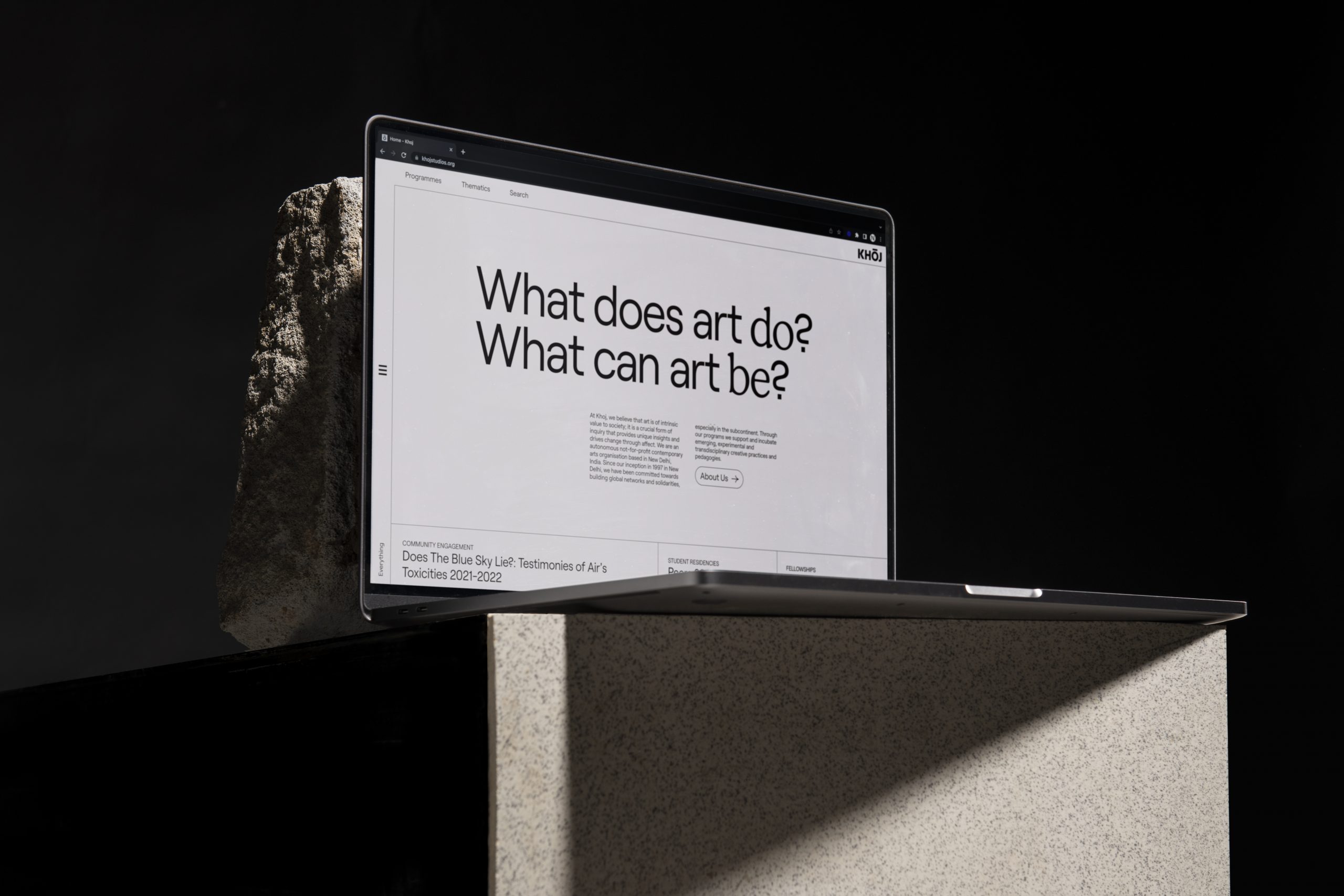
The new identity system reflects this brand idea by using the ‘O’ as a searching eye – a central device that manifests in playful ways like the hover on the hamburger menu and the waterfall screensaver.

Many design decisions, like the custom, almost-black and almost-white palette, were based on the fact that Khoj, as a curatorial organisation, needed to put the art and artist centre stage, while bringing out their own expert voice. “The typographic texture created by the two brand typefaces is also simultaneously unobtrusive and distinctive,” says Khaitan. For any typographer, this is one of the most interesting details in the visual language (and was a big contributor to the ‘Site of the Day’ and Type Directors Club accolades).

Variable type is a key feature in the Khoj identity system. The decision to use the emerging type technology (in Khoj’s case, the Roobert by Displaay Type), felt right because it reflected Khoj’s commitment to staying on the bleeding edge of art.
Variable type also served the larger website vision of using different modes for past and present content – allowing an easier transition to the thicker weights and looser leading needed for dark mode.
Rethinking Identity and Digital Experience
Before the redesign, the Khoj website was an artefact that existed because ‘everyone needs a website.’
“In retrospect,” says Pooja Sood who has helmed Khoj for 25 years, “we kept adding content to a lugubrious site without much thought to how it was being consumed.”
The site fell short on many counts: It did not showcase Khoj’s rich content archives effectively, nor did it provide a smooth experience for users looking to learn more or sign up for its programmes. Most importantly, it did not showcase the organisation’s key differentiator – its curatorial voice.

Through an analysis of past data, user research and a series of workshops with the Khoj team, Thoughtput and Novel uncovered insights that led to the creation of the new award-winning website.
“It was an intensive exercise that went beyond just the website,” says Sood. “The workshops forced us to stop and ask: Who is Khoj?”
Exploratory vs Transactional User Mindset
Khoj users came to the site with an exploratory mindset vs the goal-oriented ‘transact and exit’ modes that most websites optimise for. Artists were actively seeking to be part of a community and it was up to Khoj to deliver an experience that would address their immediate need efficiently, but also draw them in further.
Chronological > Alphabetical
Heat maps showed that the highest traffic in the Directory of Participants went to participants whose names started with the letter ‘A.’ This was a direct result of the fact that information was alphabetically organised and users simply did not go further.
The participant listing in the new site is chronologically organised, with the expectation that users will search if they are looking for a specific artist. Says Ganesh, “It is far more relevant to know who is showing at Khoj currently vs. an alphabetical list.”

Distinguishing Past and Current Content
Another interesting change is a separate lens for past versus current/future content. “When you are looking for current or future programmes, you are best served by an efficient format that highlights facts like dates and duration. When you are browsing past content, the best way to do it is through topics that may interest you,” says Ganesh.
Past and present content has also been visually distinguished in what Khaitan refers to as one of the site’s many little moments of discovery and joy. The past content is displayed in dark mode, while the current content is shown in light mode.

Organising Content via Thematics
Data showed that the older website had very low scroll depth, and that no users scrolled past the current offerings. The new site is designed to show the user a glimpse of the past legacy of Khoj even before they scroll, both on desktop and mobile.
A section called ‘Thematics’ has been introduced, where past content is organised via themes, that range from Art & The Body to Art & Digital Futures. Sood says that this also allows Khoj to showcase, at a glance, the areas they are interested in.
Heat maps show that users now scroll much further and explore past content.


Why Vocabulary Matters
The previous site lumped all Khoj’s activities and offerings under an umbrella called ‘programmes.’ Conversations with users however, showed that they viewed Khoj’s offerings in a more nuanced way: from exhibitions to residencies, courses to grants. This vocabulary and classification has now found its way into the website structure and labels.
Creating a Living Memory for Khoj
“One of many aha moments during the project,” says Ganesh, “was the realisation that in addition to serving artists and funders, the site could also serve as an institutional archive for the Khoj team.”
Once the internal team was identified as an important user cohort, the UX of the backend became as important as the front-end. The site is built on WordPress but has “insane levels of customisation ” to allow for complexities like cross-linkages, modularity, and multiple user roles.
“The end-result,” says Sood poetically, “is that the site is now Khoj’s living memory.”
Home Page Comes Last
A popular misconception is that a site’s home page is the main landing page for users.
As part of their process, Thoughtput identified multiple ways in which users typically entered the site – for example navigating from a partner site directly to a programme page.
This meant that while inner pages were configured to serve specific user needs and journeys, the home page could serve a more exploratory mission. Once a user has visited the site and accepted cookies, they are served dynamic content based on their previous browsing behaviour.

Accessibility: Not an After-Thought
Far from the check-the-box accessibility attitude that many sites follow, all teams focused hard on accessibility, even undergoing an audit by external expert, Access for All. Some of the measures include semantic markup, AAA colour contrast checks and images with alt text (WCAGA compliance).
Brand Tone-of-Voice Guidelines
The idea of accessibility was also factored into the brand’s tonal identity. “While jargon is efficient for people-in-the-know, art speak can be quite exclusionary for people outside the community,” says Khaitan. To address this conflict, Novel created a set of seven editorial guidelines titled ‘How Might We,’ which act as a guide and filter for all content. These range from checks on audience requirements to guidelines for sensitive content.

Push, Pull & Polish: The Results
The Khoj site was launched in December 2021 with a physical event where the art community could browse the site.

The overwhelmingly positive reception the site has received is backed by the upward trend in all critical metrics.
There has been a 42.8% increase in pages viewed as well as 43% increase in sessions per user.
Ganesh says that the push and pull between web and graphic design played a big part in delivering a distinctive and polished experience for Khoj. “As web designers and developers, we are used to viewing everything from a feasibility standpoint. Seeing things through the Novel team’s eyes and pushing ourselves to continually refine the site has definitely resulted in an elevated experience for users.”
Sood offers advice for anyone looking to rebuild their websites. “The problem is that social media offers a quick fix to getting content out and as a result, websites languish. Don’t make that mistake. Your site is now your face to the world, spend the time, effort and money to make sure it is a worthy one.”
Take a look at this brand reveal video for Khoj, check out the Khoj website and let us know what you think in the comments.


Oh man, stop growlin bout clients and just enjoy that cursor ⚫️
Fabulous work no doubt but I have a question for Hamsa and Ananya. How much of this is due to the nature of the client – arts collective, not for profit…. Would any commercial client let you experiment this much?
Dude, I think you’re missing the point. I’ll admit freely that I’ve worked on many content-heavy sites and never thought about content browsing behaviour so deeply. To me this is less about arts or ego and much more about how you showcase content
I think its also about just fucking great design – Dude – and I agree with Vidit that can be a hard sell to commercial clients
I work with a big fmcg brand so let me speak as the commercial client. My 2 bits: Yes, we have many more layers of approval than Khoj wd but if a strong idea is intelligently presented like this case study, it wd go thru.
Hey Vidit!
Great question + I already see some great answers!
Khoj, as a team, were dream clients, that trusted our process and shared our ambition. In Khoj’s case there were typically 8 people on every call, actively engaging and voting for most decisions. While that sounds like a lot of cooks, the fact that they worked democratically was their strength. In my experience, in other commercial/ non-for-profit establishments, I’ve had s similar experience whenever the founder/ key decision maker is involved throughout the process and not so much when, for the most part, I’m liaising with mid-management 🙂
Hope this helps!
Hi Vidit, glad you liked the work! I’ll be completely candid: I cut my teeth on corporate graphic design, and then began Novel (studionovel.in) to run in the opposite direction! You’re probably right about the ceiling on experimentation in more strictly commercial contexts—I wouldn’t really know. It was precisely the room for experimentation with such a client that attracted me to them, and so far has been a commonality with the clients and collaborators I’ve had the good fortune to work with 🙂
Absolutely stunning work. And to think I had not heard of either of these design studios. What gems
The entire branding is a concoction of mindful rumination and sheer observation of the user behavior!!
What an expression of art ???? !!!
Beautiful!!!! 🙂 One of the best ways to kickstart my work today. Truly inspirational!! Thanks so much The Hard Copy for doing this.