Chaat & Caviar: Branding a Unique Restaurant in California
Green Goose Design brands Ettan, an upscale Californian restaurant that marries Eastern sensibilities with Western expression.
-
Client
-
Type of ProjectBrand Identity
-
Studio or team
-
Year completed2019
The Client
Ettan, an upscale restaurant in Palo Alto, California, is the brainchild of entrepreneur Ayesha Thapar. It is led by Chef Srijith Gopinathan, who has earned two Michelin stars and is widely acknowledged for his innovation with Indian cuisine.
The Project
While ‘East-meets-West’ has been done many times before, Ettan claims to deliver a “unique experience that is a confluence of Californian fresh ingredients with an Indian palette.”

Ettan houses work from Indian artist, Ramachandran and photographers Rohit Chawla and Gautam Vir Prashad. The restaurant itself has been designed by Thomas Schoos, responsible for iconic hospitality brands like the Tao, Morimoto and Seersucker. Schoos is particular about the personality of his ventures and was also involved in selecting the final brand identity.
The Green Goose Design (GGD) team was charged with the mandate of creating the brand identity for the restaurant which prides itself on an “eclectic global aesthetic exemplified by deconstructed elegance that is casual chic by day and sexy by night.”
The Name
“Ettan” means Breath in Sanskrit and the GGD team points out that while rooted in India, it was phonetically suitable for a global audience. They wanted to use a word that most people would be unfamiliar with, so the restaurant could own that word and build its brand around it – “A word while soft and romantic was unexpected and unusual.”
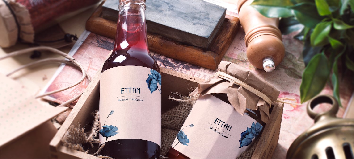
The Logo & Motif
The Ettan logotype has been hand-crafted. The narrow letters with slightly protruding cross-bars are clean and simple, but with enough eccentricity to make them memorable.

The brand toolkit includes an intricately illustrated, monochromatic floral motif that marries a poppy (California’s state flower) to a lotus (India’s national flower), again serving the core theme of a fresh new take on Indian cuisine. The floral motif can be seen on interfaces from the menus to packaging and even crockery.

The ‘E’ also works hard as a standalone mnemonic, intertwined with the signature flowers.
The Colour Palette
The primary colour palette comprises Taupe and Indigo and the GGD team says they deliberately stayed away from colours that are traditionally used to cue Indian food. Instead, the objective was to capture the fresh, outdoor feel that is associated with California. The colours are carried through the interiors, uniforms, linen and crockery.
Opening to Rave Reviews
Ettan has opened to rave reviews that include this Robb Report story about how they are disrupting Indian cuisine.
GDD founder, Arjun Sawhney says, “We scanned the Indian food scene in California for the project. One of the key insights was that Indian food and Indian restaurants were largely viewed as a cheap and basic alternative. Unlike Japanese cuisine which is perceived as a sophisticated experience, our cuisine has a more downmarket connotation in the US. The effort was thus to present an alternative message. Food that is fresh, light, aromatic, and healthier, with a beautiful setting and an aspirational vibe. Our clients coined the term, ‘Cali-Indian’ to cue Californian produce and Indian flavours. We had to find a bridge visually to connect those two geographies in a way that was special and unique.”

