Making Digilocker Easier to Use
In 2020, the design consultancy, Parallel Labs, ran a two-week sprint to make the government app, Digilocker, easier to use. Given the renewed focus on Digilocker in the recent budget, we trace how changes in the app’s flow led to wider adoption.
One morning in December 2019, Robin Dhanwani, co-founder of design studio Parallel Labs, reached Bengaluru airport only to find he had forgotten his wallet with his ID proof. His friend suggested he try getting the document through Digilocker, the app created by the Government of India, to serve as a validated, digital repository of important documents for citizens.
Dhanwani downloaded the Digilocker app and after a 20 minute struggle managed to get access to his driving license and entered the airport. The experience led him to fire off an email to Amit Ranjan, co-founder of SlideShare, who was at the time serving as ‘Architect at National Digilocker Project’ to the National eGovernance Division (NeGD) of the Ministry of Electronics & IT. (NeGD is the organisation behind Government-owned digital products like Digilocker, Cowin and MyGov.)
If only Digilocker could provide a better experience, he remembers saying to Ranjan, many more people would use it. To his delight, Ranjan replied and the outcome was a design sprint held by Parallel for the NeGD team, where they identified the biggest problems with Digilocker, zeroed in on possible solutions and tested hi-fidelity prototypes. The final results were incorporated into the app.

How Digilocker Works
Digilocker aims to remove the need to attest, carry and share physical documents by providing a repository that is validated by the Government of India. By enabling the journey to a paperless world, it also hopes to remove bureaucratic barriers and provide better governance.
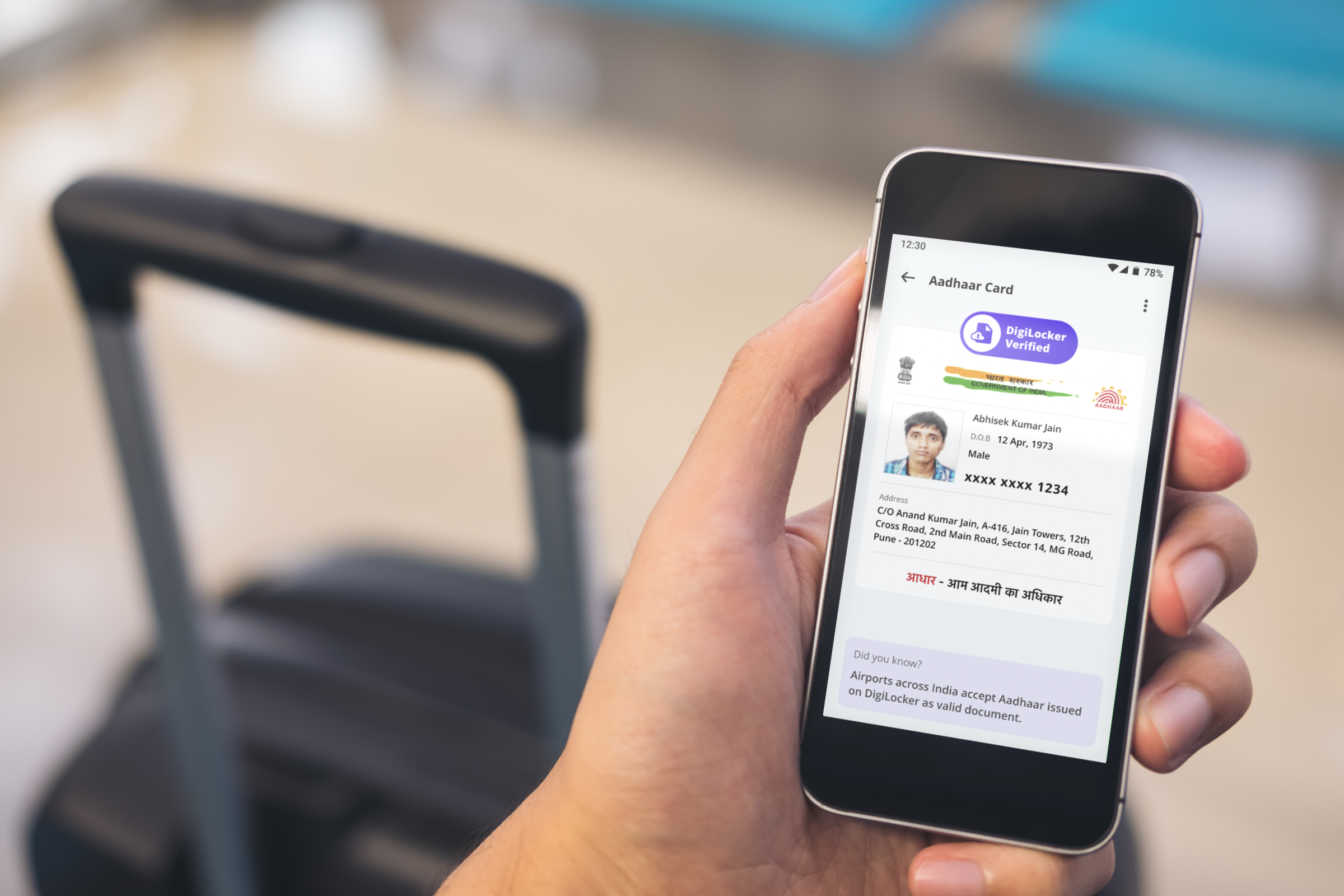
- After downloading the app, the user enters their Aadhar number and verifies their identity via an OTP
- The user can then access documents from driving licence to PAN card, TDS certificates to mark-sheets, by entering the fields required to identify the document (Example: PAN card number to access the PAN card)
- Currently more than 600 documents can be accessed via Digilocker
Sprinting Towards Solutions
Along with a host of tactical issues, Parallal’s 2 week design sprint in 2020, identified three big problems with the app and also threw up solutions, many of which were finally taken into production.
#1. People didn’t really understand what Digilocker was
The most common misconception was that Digilocker was a place to upload documents.
The sprint found that users were uploading photocopies of documents. These, of course, were not legally valid and caused consternation when shown to authorities and rejected.
This misconception was further strengthened by the fact that the app actually did provide free storage as a user hook – however this offering had overshadowed its real purpose. People were even using Digilocker to upload music and movies!
The solution
Parallel added introductory screens where – unlike most apps that insist on a sign-up first – users could understand what Digilocker was meant for before they signed up.
Users could browse the list of documents available on Digilocker and even see samples. UX copy helped to drive home the message. For example, the first couple of screens had a prominent panel about how Digilocker’s documents are legally valid under the IT Act.
“It’s better to take the time to onboard educated, aware users, rather than onboarding users who sign up under incorrect assumptions and then struggle with the app,” says Dhanwani.


Introductory screens explain the app and show a list of documents before the user signs up. Carefully crafted UX copy helps to emphasise Digilocker’s purpose
#2. The onboarding was confusing, with a 60% drop off
The sprint identified the reason for this high drop-off rate.
The only way to access validated documents via Digilocker is by providing an Aadhar number, since the app needs a fool-proof way to verify identity.
However, the app also provided an option to validate via mobile number – which allowed the user to set up the app, but would not provide access to documents, resulting in complete confusion. (Given the Supreme Court judgement of 2018 that Aadhar was not mandatory for essential services, the mobile number option could not be removed.)
The solution
The onboarding process was modified to nudge users to add their Aadhar number, while explaining the benefits of doing this. The copy reinforced the idea that the Digilocker ‘fetched’ documents.
An option to verify Aadhar manually was also added.


#3. The full power of Digilocker was not understood, which was preventing word-of-mouth and organic adoption
Even people who understood what Digilocker was meant for, did not realise the number of documents that they could access.
To address this, the screens were designed so that once a user was verified, their Aadhar card was automatically fetched and shown. Other documents in the list were shown in a ‘greyed, unselected‘ view. This helped the user understand the full scope of Digilocker and was further explained further by ‘Did You Know’ notes through the app.

The Results
“When the DigiLocker team put out the redesigned app, we were so excited to see it top the App Store charts,” says Dhanwani. Ranjan also voiced his appreciation publicly on Twitter.

The results after six months of the redesign were impressive:
- 280% increase in 30-day users, from 18% to 68%
- 7.5 million new app installs
- 67% of people who visited the app page on the App Store downloaded Digilocker
- 66% of user accounts were verified with Aadhaar (up from 54%)
- 3.4 average documents were fetched per user (up from 2.7)
Digilocker in Budget 2023
Today, Digilocker has 147 million registered users and 5.6 billion documents have been accessed so far. The app is also available in multiple languages.
In her recent budget speech, Finance Minister Nirmala Seetharaman made some big announcements about Digilocker. This included the launch of an ‘Entity Digilocker’ for organisations and a commitment to ensuring that the app became a one-stop utility for address and identity verification.
Even though Digilocker has evolved in the last couple of years, Dhanwani is pleased that their foundational work is still in place. “The Government’s reach and distribution is unparalleled, he says, “but most of their digital products have been adopted because of compliance. Imagine if we could make the experience so seamless that people would voluntarily seek out these apps and use them.”


What a brilliant example of how good UX/design can make a government-led app more usable and useful! Petition for Parallel Labs to work on the nightmarish UTS app please!