Opposite Redesigns Online Publication,The Ken
We sat down with Abhishek Sarda, Founder, Opposite, to get under the hood of the makeover
Opposite designed The Ken when it launched in 2016. What prompted the redesign?
This was an exercise focused on ‘Architecture and UX’ rather than a ‘redesign’. When The Ken launched in 2016, it was a single-feature product – just one deeply researched business story everyday. Now, they have added new content formats (Narratives), new story formats (Nutgraf), subscription options and a South-east Asia Edition.
The Ken’s user reading habits have shifted from desktop to mobile. So, everything about the 2020 version of The Ken is mobile-first.
While we have taken this opportunity to refine the visual language of the website, the focus was on readying The Ken for the evolution it is undergoing as a product and business.
Was there anything specific about The Ken reader profile that influenced the design?
The Ken’s users are very tech-savvy. They use platforms like Medium, Twitter and Instagram regularly, so we picked UX patterns that they are familiar with.
The readers are also comfortable with reading long-form content. So instead of trying to ‘beautify’ the stories, we focussed on the text and avoided unnecessary illustrations.
As one of the early readers of The Ken myself, it has been a joy to see how it has evolved and the role we’ve got to play. The Ken has established a deep following in the business community – almost every client that we’ve worked with in the last 4 years is a subscriber!
What was the scope of the redesign?
The engagement was pretty open-ended in terms of scope – everything that required reimagining or an upgrade. We worked on the Information Architecture, User Experience for discovery, reading and subscribing, updated Visual Language and finally explaining our work to the developers and audited the coded output.
The Ken is built on the WordPress platform. We built the original 2016 site, publishing and billing system for them. But since then, they’ve built an in-house tech team, who has developed the 2020 version.
What are the differences between the initial version and this newly launched one?
When we created the 2016 version, we were heavily inspired by the UX patterns and aesthetics of print magazines. This worked as a way to transition users into the long-form/subscription-only model of The Ken. So we created a publishing system that allowed writers to (almost) art-direct stories by customising the colour palette, typography, and layouts of each story. The homepage was chronological and stories were grouped under ‘weekly issues’.

With the 2020 version, we took a very different approach. I can talk you though some highlights of the new experience:
Personalisation
The homepage is now a ‘reading list’ personalised for each user – a dynamic feed of unread and bookmarked stories.
Unified discovery experiences
The Ken has launched several new products (with more to come). We designed the new discovery experience to unify story formats and editions.
Cleaner, richer reading experience
The story page has been stripped down and redesigned, with a strong focus on the story.
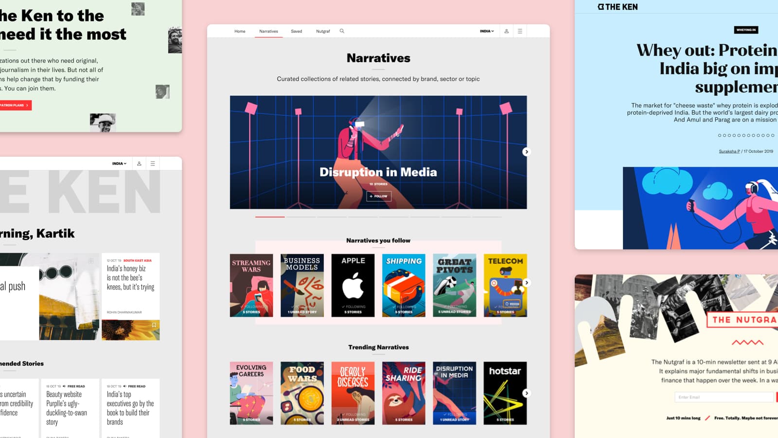
No categories, only narratives
In a departure from convention, we decided to get rid of ‘category-based’ navigation and replace it with a fluid system of ‘Narratives’, stories grouped by subjects. This allows users a ‘big picture’ view of a single subject.
Were there any fundamental design decisions you took with the first version, that have been validated and will remain unchanged?
I think some things about The Ken will be constant because they are driven by their product philosophy. Three things stand out for me.
1. Content density
One of the key design principles we agreed to right in the beginning, was low content density. This worked well with The Ken’s approach of writing deeply researched stories rather than reacting to day-to-day events. Users loved this and while the new version has more story formats, content density remains low.
2. One story at a time
Most of The Ken’s articles are long and average around 15 minute read times. So we decided to avoid aggressive ‘further reading’ suggestions that other content sites thrive on. This, coupled with the ‘Narratives’ approach, has had high user satisfaction, retaining The Ken’s positioning as a source of insightful stories.

3. Visual language
The aesthetic choices we made in the first version were well received and the ‘pink papers’ inspired colours provided a distinct identity. The redesign builds on the original visual language rather than diverging from it.
Give us some details about your choices for typography, colour and layout
Typography
Typography is core to The Ken’s aesthetic, and it needs a deep system to meet editorial and non-editorial requirements.
We chose GT America from Grilli Type as the primary typeface because of its versatility. This is used across the UI – Condensed for Story cards (to accommodate long headlines), wider weights for headings, etc.
The long-form content of stories is set in Charter (designed by Matthew Carter). It works well as a reading font on screens and is something web users are subconsciously accustomed to, due to its wide-spread use.
Finally, the headlines on the story pages are set in Jazmin – it imparts a distinct personality to the pages without overpowering the tone.
Colours
We’ve largely stuck to the original palette of grey, white, and ‘pink paper’ pink with the addition of a few pastel shades for use on story pages and some of the forthcoming products.
Layout
Our approach with layouts has largely remain unchanged – clean, mostly single-column layouts, no side bars, low density – but still held together by a strong grid. The trend of loose grid layouts seemed inappropriate for a publication that exudes a certain gravitas.
How did you test the new design?
The redesign had a very tight timeline. The new design was meant to be launched with The Ken’s South-East Asia edition. However, products you use and love are easy to test. We tested the new design with everyone at the studio who reads The Ken and the client tested it internally. Testing and tweaking will continue over the next few months.

